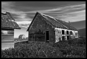
Another in my short series: “About the Shot”… When you see a set of aging building with this much character, it’s not hard to know there’s a good shot to be had… somewhere. Sometimes, the trick is simply finding the right place to stand.
This old homestead was once someone’s brand new dream. Someone nailed all those shingles to the wall with plans in their head, hope in their heart, and a world of possibilities on their horizon. Maybe their dream turned out well. Maybe they lived a long happy life here. Whatever the truth of the matter, these old buildings are decaying, and that’s the story that can be told in this photograph.
One thing I try to do with nearly every scene is bring a sense of depth to a two-dimensional image. Most directly, the human brain perceives depth because our heads have two eyes. Each sees a slightly different image, and our brain interprets these to realize a 3 dimensional world. But, there are more ways for the eye and mind to perceive depth.
One approaches that’s strongly employed in this image is what I like to call near-and-far. The building at the center and the building in the distance are both familiar human-scale objects. We know how big the house is, and we know how big the barn is. When we see them both together, we know about how much distance is between them. This brings the viewer’s mind “into” the picture… into the space between the buildings. Can you imagine how far it is between these buildings? It’s easy to get a sense for it. The windows and doorways on both buildings just add to this effect.
Similarly, the grasses in the foreground, and the grain of the wood at the left repeat further away from the eye. Even though we can’t see all the detail in the grasses and grain in the distance, we know it exists. We know what it looks like. This gives the image more perceived detail and depth.
Probably the most obvious depth element is the angular view of the house at the right. Straight lines converge as they go to the distance… and that’s easy to see here.
The framing of this photo is obvious (if anything, a bit too obvious and contrived). I took care to make sure the edges of the buildings all had space around them. The building at the left is simply foreground. It can be a little difficult to know just how much of such a building to leave in the frame. My rule is to leave just enough so that it’s obvious what the cropped item is, but not so much that it overwhelms the image. If I had left less of the building at the left, it would have looked like a sliver, and made the viewer curious to know what it was… and been a distraction. If I had left more of the building, it would have crowded the frame and become the subject of the image. As it is the building serves two purposes – both a “frame” and a foreground.
The original image was quite pretty in full color. The grasses were green, the sky a powder blue with white streaking clouds, and the buildings a nice silver. However, this conflicted with the story I first was drawn to in this image. The colors were all “alive”, but the buildings were dead, and that was too much conflict. An autumn or winter scene would work well in color, but there was so much lively green in this image, it just had to go.
One last comment about the wires connecting the buildings. I was shooting this with a number of other photographers standing nearby who declined to take the image because of the wires. While I can understand that you might want to crop-out wires in many landscape situations, this is one case where the wires added to the scene. The wires connect the two buildings, and frame the barn. The wires are decaying and drooping as well, and part of the story. It’s easy to get something in your head as a rule (must… not… photograph… telephone… wires!!!), but just remember that every rule needs to be broken from time to time – otherwise, the world would be a boring and predictable place. I love the wires!